Keep in mind that adwords is just a tool to bring more people to your website, nothing else nothing more. So if your Digital Strategy is not ready or if you don’t really know what you’re trying to do, you gonna waste time and money. But don’t forget those adwords steps:
- Create ads group with around 20 keywords in each
- Optimize your landing page based on those keywords
- Track keywords that people are actually googling for your specific service or product
- Focus on quality score
So once again if you’re a bit familiar with Adwords, nothing very new. It’s just good to keep in mind.


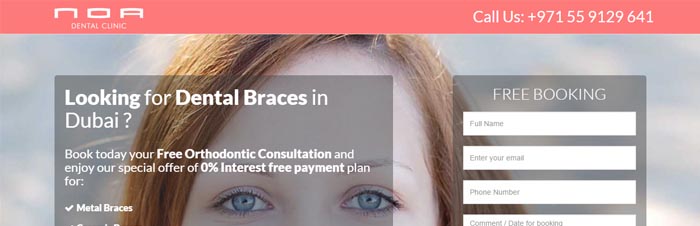
- Targeted Expression: Here is the main expression we’re targeting. We put it in bold to be sure people will see it at first sight
- Bullet points: We do love providing information this way. People don’t have to read to get the important elements
- Call To Action: Free is a bit tricky expression as it may sounds a bit cheap. However, we usually have a good return on it. Then our CTA button is in orange to get people attention
- Contact: Rather than icon we like to put a clear CTA here. Phone is a good way to track conversions and it’s good to provide more information

- Doctor presentation: Photo obviously would help, but the idea is just to explain who will take care about you
- Clinic: Same vey few info to explain that we are a real location with experience
- Review or proof of concept: Linked to the original sources, this is an important element to showcase. Don’t use it if you have no original source to link to
- Video: A 1 min video can be amazing to showcase your products or services. No need to make a very good video. Short and straight to the point may be the key

- Keywords: Same it’s good even for your quality score and to remind people what your page is speaking about.
- Photos: Don’t be scared of your products. If you have some cool pictures you should showcase them
In this case our page is bit long. So we like to remind people what they are supposed to do on our page.

- Call to Action: This call to action will just redirect people to the top of the page. But better to remind them what they have to do
- Location: It’s an other important element. Better to remind people where you are (if it’s not just online of course)
- Reviews: We add another source of reviews to be sure that people know how good we are
A landing page is not a website. So don’t try to make it look like it’s your unique chance to provide information to people. Keep it clear and focus into 1 element or action. Be sure that you drive the relevant traffic and provide them what they need not what you wanna tell them !
Bonus we added a chat on this page to be sure that people speak to us !
So what do you think of this example ?
SUB MENU
LAST BLOG POSTS